Note
Go to the end to download the full example code.
Discover biases in metrics by site#
While dealing with multisite data, we need to be careful when reporting our metrics.
Performance metrics give us an overall idea of the model’s performance across all samples (subjects). However, there might be hidden biases in our data that these metrics might overlook.
In these exercises, besides computing the overall metric, we will compute each of the metrics, but using the subjects present in each site.
Importantly, we will always train our ML model on the whole dataset, but only desegregate the metric calculation by site.
Imports#
import matplotlib.pyplot as plt
import numpy as np
import seaborn as sns
from sklearn.linear_model import LogisticRegression
from sklearn.metrics import balanced_accuracy_score, roc_auc_score
from sklearn.model_selection import train_test_split

from uniharmony import verbosity
from uniharmony.datasets import make_multisite_classification

sns.set_theme(style="whitegrid")
verbosity("error")

random_state = 42

clf = LogisticRegression(random_state=random_state)
This is the main function for this notebook.
from uniharmony.metrics import report_metrics_by_site

# One metric or a list of metrics to calculate.
metrics_to_use = [balanced_accuracy_score, roc_auc_score]

# While we compute two metrics, we will only plot one.
metric_to_plot = str(metrics_to_use[0].__name__)
Data generation#
Let’s create the first scenario: a dataset with 3 good sites and 1 bad site (signal strength = 0) to show the effect of having a bad site in the dataset
# Data generation
n_bad_sites = 1
X_bad, y_bad, sites_bad = make_multisite_classification(
    n_sites=n_bad_sites,
    signal_strength=0.001,
    site_effect_strength=0,  # No EoS
    random_state=random_state,
)

# Simulate "good" sites
n_good_sites = 3
signal_strength = 1
X_good, y_good, sites_good = make_multisite_classification(
    n_sites=n_good_sites,
    signal_strength=signal_strength,
    site_effect_strength=0,  # No EoS
)
# Increase site labels for good sites to avoid overlap with bad sites
sites_good = sites_good + n_bad_sites

# Concatenate both simulated sites
X = np.concatenate([X_bad, X_good], axis=0)
y = np.concatenate([y_bad, y_good], axis=0)
sites = np.concatenate([sites_bad, sites_good], axis=0)

# Split
X_train, X_test, y_train, y_test, sites_train, sites_test = train_test_split(
    X, y, sites, random_state=random_state
)

clf.fit(X_train, y_train)
y_pred_s1 = clf.predict(X_test)
metric_s1 = report_metrics_by_site(
    y_test,
    y_pred_s1,
    sites_test,
    metrics_to_use,
)
# The result is a dictionary containing the metrics as the first key, and then the overall performance followed by the performance obtained in each site.

print(metric_s1)
{'balanced_accuracy_score': {'overall': 0.6692276910764305, 0: 0.5306512248362842, 1: 0.791335453100159, 2: 0.8324468085106382, 3: 0.8158536585365854}, 'roc_auc_score': {'overall': 0.6692276910764305, 0: 0.5306512248362844, 1: 0.791335453100159, 2: 0.8324468085106383, 3: 0.8158536585365853}}
Scenario 2
n_bad_sites = 3
X_bad, y_bad, sites_bad = make_multisite_classification(
    n_sites=n_bad_sites,
    signal_strength=0.001,
    site_effect_strength=0,  # No EoS
    random_state=random_state,
)

# Used to simulate "good" sites
signal_strength = 1
X_good, y_good, sites_good = make_multisite_classification(
    n_sites=1,
    signal_strength=signal_strength,
    site_effect_strength=0,  # No EoS
    random_state=random_state,
)
# Increase site labels for good sites to avoid overlap with bad sites
sites_good = sites_good + n_bad_sites

X = np.concatenate([X_bad, X_good], axis=0)
y = np.concatenate([y_bad, y_good], axis=0)
sites = np.concatenate([sites_bad, sites_good], axis=0)
X_train, X_test, y_train, y_test, sites_train, sites_test = train_test_split(
    X, y, sites, random_state=random_state
)

clf.fit(X_train, y_train)
y_pred_s2 = clf.predict(X_test)
metric_s2 = report_metrics_by_site(y_test, y_pred_s2, sites_test, metrics_to_use)
## Let’s analyze the global performance obtained in each Scenario for the metric that we decided to plot.
# Extract global performance for both scenarios
metric_global_s1 = metric_s1[metric_to_plot].pop("overall")
metric_global_s2 = metric_s2[metric_to_plot].pop("overall")
print("=="*40)
print(f" Overall performance for Scenario 1: {metric_global_s1:0.4f} \n Overall performance for Scenario 2: {metric_global_s2:0.4f}")
================================================================================
 Overall performance for Scenario 1: 0.6692
 Overall performance for Scenario 2: 0.6460
## Now, let’s explore the performance obtained in each of the sites.
sites_unique = np.unique(sites)

# Visualize both scenarios
fig, axes = plt.subplots(1, 2, figsize=(15, 6))

# Scenario 1
site_scores_s1 = [metric_s1[metric_to_plot][s] for s in sites_unique]

sns.barplot(
    x=sites_unique,
    y=site_scores_s1,
    color="steelblue",
    label="Site Scores",
    ax=axes[0],
)
axes[0].axhline(
    metric_global_s1,
    color="black",
    linestyle="--",
    label=f"Global: {metric_global_s1:.3f}",
)
axes[0].axhline(
    0.5,
    color="red",
    linestyle="--",
    alpha=0.7,
    label="Chance level: 0.5",
)
axes[0].set_xlabel("Site")
axes[0].set_ylabel(metric_to_plot)
axes[0].set_title("Scenario 1: Good Overall, One Site Fails")
axes[0].legend()
axes[0].grid(True, alpha=1, axis="y")
axes[0].set_ylim([0, 1])

# Scenario 2
site_scores_s2 = [metric_s2[metric_to_plot][s] for s in sites_unique]
sns.barplot(
    x=sites_unique,
    y=site_scores_s2,
    color="coral",
    label="Site Scores",
    ax=axes[1],
)
axes[1].axhline(
    metric_global_s2,
    color="black",
    linestyle="--",
    label=f"Global: {metric_global_s2:.3f}",
)
axes[1].axhline(
    0.5,
    color="red",
    linestyle="--",
    alpha=0.7,
    label="Chance level: 0.5",
)
axes[1].set_xlabel("Site")
axes[1].set_ylabel(metric_to_plot)
axes[1].set_title("Scenario 2: Bad Overall, One Site Excels")
axes[1].legend()
axes[1].set_ylim([0, 1])

plt.tight_layout()
plt.show()
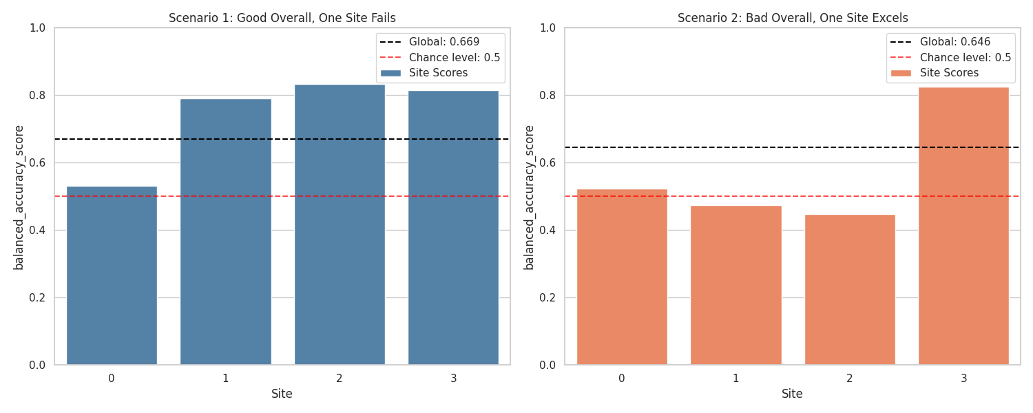
But, how is it possible that they have an similar overall performance? Where is the catch? The sites have different number of samples!
In the first scenario, even when the first site is bigger, the other 3 compensates the bad performance. In the second scenario, the last site (good one) is bigger an pushes the overall performance up.
If we had only reported the overall performance, we would not be able to unravel the site’s behavior.
Total running time of the script: (0 minutes 3.031 seconds)